Theme editor

Scale Model Shop

1st attempt at a face, your opinions?

Status
Not open for further replies.
Joined
Apr 7, 2012
Messages
3,008
Reaction score
0
Points
0
1/3
Thread owner
As the title says I've had a go at painting a face, its not fantastic but wanted your thoughts, to be fair it loos a lot better when the camera flash isn't washing it out :)


View attachment 114630


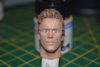
I can see myself that the lips need a different colour and the pupils need dotting, but please jump in and help out :)


Adrian

View attachment 227653
 

Attachments

  • 003.JPG
    003.JPG
    2.5 KB · Views: 0
Well if I could do a quarter as good I would be happy, incredible work
 
to give your eys some life after dotting the pupils on, give them a slight off centre tiny highlight of white or similar. Either that or maybe a coat of gloss to get a nice catch light effect.


This is a suggestion from my photography hobby... I haven't tried it on a model so maybe someone can agree or slate it!
 
That's very good for a first attempt , what scale is it ?


To get a better definition on the face lines you could use a pin wash in the creases an a dry brush just to give the face a bit of depth
 
very nice Adrian,for a 1st try your on the right track, ;)


what Dougie,said to make the eyes stand out i would of said,


to get the pupils on,i use a cocktail stick,as you cannot real over load it


with paint and just a dot in each eye,


you do need to refine around bottom/top of the eyes,and in most .I use beige tinned with a


little smoke ,or gray to show them off,and a very fine line upper/lower of a red beige to show,


the eye outline,


lips on men are always hard i fine,as there not ment to real be a red color but some were between


a dark flesh color is what i use and then give a wash with burnt cad,red,,


this should get into all the lines around the nose,lips,chin,and even ears,


his hair and eyebrows are great looking well done, ;)
 
Thread owner
Thanks all,


I can see where I need to improve now, though I don't want to make his face too hard lined. I see lots at shows and a lot of people like them but to me they look almost zombie like, if that makes sense.


This picture below is what I'm trying to say :)


View attachment 114633


Now I know its great work and he's one of our members and has won competitions with his work, but to me it's over done.


I was trying to create smoother transitions in the face tones but have a long way to go :)


Adrian

View attachment 227656
 

Attachments

  • 024.JPG
    024.JPG
    2.7 KB · Views: 0
\ said:
Thanks all,
I can see where I need to improve now, though I don't want to make his face too hard lined. I see lots at shows and a lot of people like them but to me they look almost zombie like, if that makes sense.


This picture below is what I'm trying to say :)


View attachment 125767


Now I know its great work and he's one of our members and has won competitions with his work, but to me it's over done.


I was trying to create smoother transitions in the face tones but have a long way to go :)


Adrian
I think I know what you mean Ade if you look at the hands on the figure of the man it seems the painting is smoother and the tones high and low lights run into each other better than the face which although is very nice seems a bit harsh
 
\ said:
Thanks all,
I can see where I need to improve now, though I don't want to make his face too hard lined. I see lots at shows and a lot of people like them but to me they look almost zombie like, if that makes sense.


This picture below is what I'm trying to say :)


View attachment 125767


Now I know its great work and he's one of our members and has won competitions with his work, but to me it's over done.


I was trying to create smoother transitions in the face tones but have a long way to go :)


Adrian
From what I understand Adrian that can only be done with oil paints , that proccess is layered , light to dark , I personally don't like that look I think it looks too cartoon , nether the less it's done by a very skilful person
 
A tip -


Don't use black for the pupils. It's far too harsh at these scales.


Use a mid to slightly dark grey.


You'll be surprised at how effective it is.


I tried painting Pat McGoohan for my Prisoner Lotus 7.


In the end, I found a nice portrait of him on the web, made a waterslide decal and applied it over the figure face.


Microsol helped it settle in to the nooks and crannies, and then I added more paint after that.


I'm fairly happy with the result.


Roy.


View attachment 114658


View attachment 227681
 
Cracking first attempt and know what you mean about the zombie look amazing painting on the uniform but that face is weird looking
 
\ said:
A tip -
Don't use black for the pupils. It's far too harsh at these scales.


Use a mid to slightly dark grey.


You'll be surprised at how effective it is.


I tried painting Pat McGoohan for my Prisoner Lotus 7.


In the end, I found a nice portrait of him on the web, made a waterslide decal and applied it over the figure face.


Microsol helped it settle in to the nooks and crannies, and then I added more paint after that.


I'm fairly happy with the result.


Roy.


View attachment 125792
wow Roy,


what a very neat idea,


but for me its far out of my rage to be able to do,


that type of stuff I just cannot get right,


but a great idea, ;)
 
I do see what you mean Adrian,with that figure,


it is done very well and so much credit to who painted it,


but it dose cross the line of life like to me,I real just cannot think of what


I,m trying to say more mannequin like,than real life ? :rolleyes:
 
Status
Not open for further replies.
Back
Top