1/3
You are using an out of date browser. It may not display this or other websites correctly.
You should upgrade or use an alternative browser.
You should upgrade or use an alternative browser.
The Choice
- Thread starter PaulinKendal
- Start date
1/3
1/3
1/3
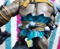
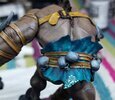
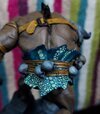
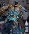
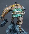
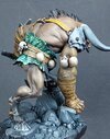
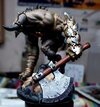
I like that. The turquoise contrasts nicely with his skin tones.
1/3
1/3
Hi Paul. Nice work.
I think I’d be tempted to make up a test piece to try the glazes on…..and start with dark colours as they tend to make better, more transparent, glazes….and of course use glaze medium as the diluent…..
I think I’d be tempted to make up a test piece to try the glazes on…..and start with dark colours as they tend to make better, more transparent, glazes….and of course use glaze medium as the diluent…..
- Joined
- Apr 27, 2018
- Messages
- 14,905
1/3
Paul,
That is looking the nuts mate.
That is looking the nuts mate.
1/3
Allen Dewire
New member
1/3
Paul, words kind of escape me at the moment. Not being a figgie builder and knowing little about fantasy subjects, this beast is fascinating, most ugly, scary and sooooo cool!!!...Great work and color choice. If the others come out like this one, it's going to be an epic scene...
Prost
Allen
Prost
Allen
1/3
1/3
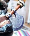
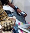
The axe already looks distressed to me Paul. Have you thought about just darkening the nicks and dents with something like a gunmetal shade, then highlighting the edges with your brightest silver to make them more visible?
G
Guest
Guest
Could say its an Anaconda Snake skin .If you go for lizard skin (pretty damn big lizard, but hey Ho) best advice I can give is find a picture of one you like and copy it…..
G
Guest
Guest
Looks perfectly acceptable as it is Paul as Tim says.
1/3
I was thinking Gila monster John….but then, being fantasy it could be dinosaur or such like….Could say its an Anaconda Snake skin .
1/3
That's on the money - I was thinking dinosaur too.I was thinking Gila monster John….but then, being fantasy it could be dinosaur or such like….
1/3
I've certainly considered breaking out the Molotow chrome. But it makes all the gold look too subdued. If the metallics are to match, I think the chrome needs handling with extreme caution. I was thinking verdigris might give me the variation I'm after without boosting the glitter out of balance with the gold.The axe already looks distressed to me Paul. Have you thought about just darkening the nicks and dents with something like a gunmetal shade, then highlighting the edges with your brightest silver to make them more visible?
Since I rejected (petulantly, perhaps) NMM, I've increasingly found that, with TMM, the less actual bright metallic paint visible, the brighter the item appears. So taking tones right down (without losing a subdued hint of metal), then popping it right back up with a few highlights looks great.
The main face of the blade is a big slab of metallic purple - it needs breaking up, I reckon.
- Joined
- Apr 27, 2018
- Messages
- 14,905
1/3
Paul,
the axe looks fine to me and sets off a great piece of figure work.
the axe looks fine to me and sets off a great piece of figure work.
1/3
I've started on it with oil washes. First time I've used oil and it's an instant revelation - no stress, plenty of time for consideration and correction. The axe blade is already looking better!
Legal Notice
scalemodelling.co.uk is a privately operated online discussion forum. All content posted by members reflects their own views and opinions and does not necessarily represent those of the forum owners or administrators. While reasonable efforts are made to moderate content, no responsibility is accepted for user-generated material. By using this site, you agree to comply with UK law and the forum rules.


