G
Guest
Guest
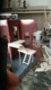
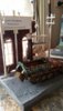
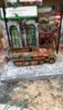
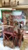
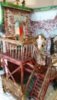
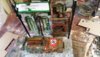
This has come on nicely since I last stuck my head round the door Monica. I like the camo on the half track and the figures look great as well.


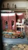
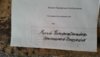
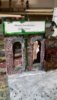
The font is way to modern...I am sure that you can find one a bit more time relevant...I know its a small thing but it is kind of 'in your face' ...What does it say? :|
It was just that the lettering seems to modern, If it is just a "place holder" for your thought, no problem")
do,you have any ideas, for this one, :S plz,You can set the keyboard to Russian and then set the typeface and font as normal
алпкзйьаду аькуйз жицу
The trick is to have a key board map so you know which letter will be which.
You can also select the specific letters using insert symbol the symbols should have Cyrillic letters.
and to be honest I never gave the lettering a second thought.
oh wow,Dave,all that just go,s right over the top of my head lol, :S
I did have a look,at the language bar and only have,UK,English,US,English,and Aust,English,so with win7 over hear thats all they give you,
and some where you ,must have to get others from some were,
 , all the languages should be available but you do need to dig through settings to add them to the "active list" for selection
Sorry Moni, not my intention
Easiest for you would be to use google translate to get the Cyrillic text and then copy paste the text into a wordprocessor and play with the fonts to get something you like.
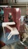
Im pretty sure they had stencils back then so, having a typed sign would be accurate, also calligraphy is an art dating back hundreds of years, I would suggest you keep the typed sign instead of the hand written one, as it looks better and probably is more accurate.


scalemodelling.co.uk is a privately operated online discussion forum. All content posted by members reflects their own views and opinions and does not necessarily represent those of the forum owners or administrators. While reasonable efforts are made to moderate content, no responsibility is accepted for user-generated material. By using this site, you agree to comply with UK law and the forum rules.