
You are using an out of date browser. It may not display this or other websites correctly.
You should upgrade or use an alternative browser.
You should upgrade or use an alternative browser.
Red highlights?
- Thread starter Alan 45
- Start date
- Status
- Not open for further replies.
The painting guys-water colours, oils etc tend to use a rose colour and add a touch of yellow. But it is a fine line. Try just painting the red, once dry use some white and rub with a sponge that way you get a worn red look.
Cheers mate I can't do a worn look as its on fabric and it ceremonial wear so it's more of a natural light shade I need but with what you've said I could use a very slight okra in a bit of red then blend it but I've got to let it dry completely first
Thanks for your help")
Thanks for your help
G
Guest
Guest
Red on the spectrum is red. There is no such thing as a high lighted red although there are lots of reds to be had.
I would imagine Alan the instructions to highlight would mean to have it reflective ie varnish over to catch the light. Or use a gloss red. Or a translucent red going through to a reflective base. I can see no other way of highlighting.
Laurie
I would imagine Alan the instructions to highlight would mean to have it reflective ie varnish over to catch the light. Or use a gloss red. Or a translucent red going through to a reflective base. I can see no other way of highlighting.
Laurie
G
Guest
Guest
I'd use a darker red first & highlight with a standard red - the darker tone will make the brighter red look like the worn or older area.
G
Guest
Guest
Totally agree with Patrick dark red then normal red
G
Guest
Guest
Ditto!
G
Guest
Guest
But you get highlights on any colour if it is reflective, ie shiny.
View attachment 107619
View attachment 220642
View attachment 107619
View attachment 220642
Where is Paul P when you need him eh?
For true highlights paint it red and when 200% dry, you could drybrush the high points with white. But as said only real issues if the fabric is shiny.
Take a red T-shirt and throw it down to get lots of folds: Shadows and High-lights. Then find something red and shiny. The wife must have "something" look at the difference in the highlights.
They will have bright Highlights, the T-shirt will not.
Hope that helps you understand.
Ian M
I'd paint it red as a base colour and then paint the creases and folds with a mix of the red and burnt umber and the really deep folds almost just burnt umber then what's left of the base coat will become the highlights
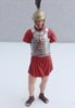
I don't know how to explain it so here's a pic at what it looks like now , I've done the shadow in the creases I just need a colour for the top View attachment 107621
View attachment 220644
View attachment 220644
Attachments
that is looking good as is,and remember its cloth not silk/satin,so will not have a real gloss shine to it,
I tend to agree with Patrick,John and that would be how i would do as well,
maybe a touch of burnt umber in the very bottoms of the folds as said by John,and if your brave
you could try just the lightest touch of a white on the very tops,of the folds,were you think the sun would hit,")
I tend to agree with Patrick,John and that would be how i would do as well,
maybe a touch of burnt umber in the very bottoms of the folds as said by John,and if your brave
you could try just the lightest touch of a white on the very tops,of the folds,were you think the sun would hit,
Looks good to me but if you want to add more I'd just put umber into the deepest creases working outwards with umber and red mixed in different ratios/tones leaving the high points untouched looking good though Alan\ said:I don't know how to explain it so here's a pic at what it looks like now , I've done the shadow in the creases I just need a colour for the top View attachment 118175
G
Guest
Guest
hi Alan shading red is always the tricky one so you need base red, deep orange yellow and burnt umber, you deepest shade will be burnt umber rising in redness to get to the base red, for the highlights add a touch of orange to the red and keep going until the very top highlight with a touch of yellow
View attachment 107628
View attachment 107629
heres a few pics of the colour sgt for illustration
the alternative is use red for the highlighted areas and just shade everything else darker, but for your figure I would go for the first method
if you look at the very top of the creases on the arms and the red stripe on the trousers they are in fact straight yellow but they blend with the red and orange to give the look of red
View attachment 220651
View attachment 220652
Cheers Paul that's exactly the look I would like to do thanks for the pics thy hey are fantastic buy the way
I have already used the burnt umber in the folds but I think I need to do it a little darker and go from there
Thanks again to everyone
I have already used the burnt umber in the folds but I think I need to do it a little darker and go from there
Thanks again to everyone
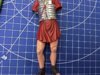
So I've had a bash myself
I've had to define the photo just slightly to take the glossy look away so you get a more realistic look of how it looks if your holding it in your hand looking at it
It's not as good a pauls but then who is when it comes to figures but I'm learning , I hope ! View attachment 107631
View attachment 220654
Attachments
G
Guest
Guest
Whats not as good, that looks the dogs doo dahs mate. Beautifully done

- Status
- Not open for further replies.
Legal Notice
scalemodelling.co.uk is a privately operated online discussion forum. All content posted by members reflects their own views and opinions and does not necessarily represent those of the forum owners or administrators. While reasonable efforts are made to moderate content, no responsibility is accepted for user-generated material. By using this site, you agree to comply with UK law and the forum rules.