Theme editor

Scale Model Shop

D&D wizards

Thread owner
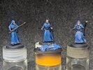
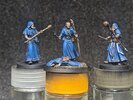
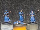
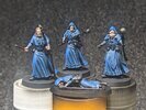
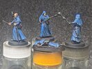
The main blue is going down on the clothing parts.

Looks to be far too much of the shadow colour in the pictures but doesn't look quite so bad in real life. I keep hearing that lots of contrast is good at this size but might try a glaze to even things out. Lots of trim to do as well which will also alter the look, but it's a start.
PXL_20230429_162109244.jpgPXL_20230429_162153976~2.jpg
 
Coming on nicely. Contrast looks fine as well. However, I would say that you need to reevaluate the mid tones and paint some of them back in. There are some areas where the shadow tone has overrode the mid tone so make him (or is it them) look a little darker than he (they) should. Middle figure lower front of the robe illustrates this…..it looks black with highlights rather than blue with shadows.
 
Thread owner
Thanks Mick.

Tim, that's a much more eloquent way to describe what I was trying to say, thanks.

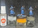
I started from black and worked my way up but the prussian blue layers seem almost invisible on camera, it just jumps straight to the lighter deep blue that I put on top.

I still have the colours and intermediate mixes on my pallet so I'll have a go at working my way back down.
Prussian blue is semi transparent so doesn’t quite cover as you expect. Also dries shiny in my experience……the lighter blue, made by adding white I assume, is more opaque due to the titanium white pigment you’ve put in the mix. If you do look to glazing it, by the way, use the Prussian blue with glazing medium, it will glaze far more successfully. Anything with added white just doesn’t work as well.
 
Thread owner
Thanks Tim, will try and improve them tomorrow.

Thinking about it the deep blue is one of AK's Intense range which I believe are more opaque than their regular acrylics. Combining that with you saying prussian is semi transparent might explain the huge jump.

I've still got so much to learn :smiling5:
 
The main blue is going down on the clothing parts.

Looks to be far too much of the shadow colour in the pictures but doesn't look quite so bad in real life. I keep hearing that lots of contrast is good at this size but might try a glaze to even things out. Lots of trim to do as well which will also alter the look, but it's a start.

Bloody lovely...
... that's all. ;)
 
Fantastic work andy , the shading is brilliant , its making me want to have another go at something like this , maybe another one of the Airfix 54 mm jobbies. Btw , I’ll have a pint of whatever the guy at the front is drinking ! Cheers tony
 
Thread owner
Thanks for that Andy. They look a bit pricey but great quality. Question is though, how can anyone find that they sell them if they don't know to look for "adventurers"? Pretty poor for a website unless I've missed something.
Agreed. I only found them by chance and I knew what I was looking for!

Thanks for the encouragement everyone.

There are bound to be hiccups along the way when trying something new but with a bit of adjustment today I should get them looking more like I was aiming for.

Oh, and one guy has lost his wand for the third time so it's staying off until the very end! :smiling5:
 
Thread owner
A bit closer to what I was looking for.

PXL_20230430_112137024.jpg

The silver trim was an absolute bear, right at my limits, but at least I've given the impression of it. A few touch ups to it once my hands aren't so shaky from trimming the hedges and I'll be happy.
 
Thread owner
Thanks Jim & Paul.

Mostly the fiddly "stowage" left now.
 
Thread owner
Last pictures for today, honest :smiling5:

A few finishing touches are left and I need to do something about the bases but with the snooker starting soon that'll have to be tomorrow when I'll probably put them straight into the completed section.

PXL_20230430_163340053.jpg

PXL_20230430_163412983.jpg

PXL_20230430_163454801.jpg

Thanks for looking and all of the encouragement.
 
Excellent stuff…….very impressive. The blue looks fantastic now. I would put some effort into the bases though. The mantra is faces, bases, shields, and flags for things that make the complete figure really pop. Is it just me though, or does the guy on the left look like he’s wearing a bright blue mills bomb?
 
Thread owner
Thanks very much Tim.

I imagined it as some kind of glowing potion bottle but it's gone a bit funky looking :smiling5:
 
Beautiful, some excellent shading on these..although i still think they need to give the bloke having a nap a swift kick..lol
 
Back
Top