You are using an out of date browser. It may not display this or other websites correctly.
You should upgrade or use an alternative browser.
You should upgrade or use an alternative browser.
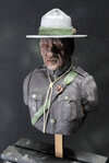
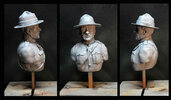
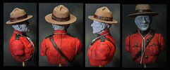
John's sculpt 1/6, Canadian Mounted Policeman.
- Thread starter wotan
- Start date
Neil and Mick Much appreciated your kind comments.
I started to paint his jacket and then I thought, lots of people have trouble painting red since it is a difficult colour to shade and highlight without using black or white to dull the colour. Now as you know colours have three primary characteristics, HUE (or colour e.g. blue yellow red etc.) VALUE (or how light or dark the colour is when measured against a grey scale i.e. white to black) and finally SATURATION or CHROMA (or how bright or dull the colour is, fresh green grass being highly saturated green and German field grey being very low saturation green). When highlighting reds or yellows for instance you should not adjust the VALUE of the colour but adjust the SATURATION. Now this is easier said than done.
A technique I use is to paint a monochromatic underpainting first and then apply thin to thick coats of colour over this. The old master painters called this Grisaille underpainting. It resembles the zenithal spray technique that many figure painters use spraying black from below the figure and white from above. Painting a grisaille underpainting is just taking this darkening and highlighting one stage further.
In the photos below the first row indicates my version of a grisaille, the second shows a thin coat of fairly low SATURATION red, and finally a top coat of very highly SATURATED red. You will see that I paint any dark outlining that I want at the first stage, and this is done in a dark brown (not black) for a red finish.
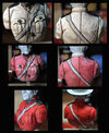
I will continue to work this adding back some of the shadow tones that may have got lost and perhaps some of the lining. Note in the first row of images I do not try to be too subtle in blending the lights and darks. Red having a generally middle VALUE will lighten the darks and darken the lights causing the unblended underpaint to look more blended. I hope you can see in the third row of images how subtle the final result is beginning to look.
John
I started to paint his jacket and then I thought, lots of people have trouble painting red since it is a difficult colour to shade and highlight without using black or white to dull the colour. Now as you know colours have three primary characteristics, HUE (or colour e.g. blue yellow red etc.) VALUE (or how light or dark the colour is when measured against a grey scale i.e. white to black) and finally SATURATION or CHROMA (or how bright or dull the colour is, fresh green grass being highly saturated green and German field grey being very low saturation green). When highlighting reds or yellows for instance you should not adjust the VALUE of the colour but adjust the SATURATION. Now this is easier said than done.
A technique I use is to paint a monochromatic underpainting first and then apply thin to thick coats of colour over this. The old master painters called this Grisaille underpainting. It resembles the zenithal spray technique that many figure painters use spraying black from below the figure and white from above. Painting a grisaille underpainting is just taking this darkening and highlighting one stage further.
In the photos below the first row indicates my version of a grisaille, the second shows a thin coat of fairly low SATURATION red, and finally a top coat of very highly SATURATED red. You will see that I paint any dark outlining that I want at the first stage, and this is done in a dark brown (not black) for a red finish.

I will continue to work this adding back some of the shadow tones that may have got lost and perhaps some of the lining. Note in the first row of images I do not try to be too subtle in blending the lights and darks. Red having a generally middle VALUE will lighten the darks and darken the lights causing the unblended underpaint to look more blended. I hope you can see in the third row of images how subtle the final result is beginning to look.
John
Allen Dewire
New member
1/3
Excellent work Mr. B!!! And thank you for the background info too. I learn so many interesting things on here. One day, I hope to try some of them...
Prost
Allen
Prost
Allen
1/3
Great SBS John. Red is far from my favourite colour to work on. I always end up killing the contrast and ending up with a flat result…..must try this next time……
1/3
Looking splendid John.
G
Guest
Guest
Very informative John, thanks . Starting to look really good with the colour following the first coats as you described.
Yet another piece of Witchcraft that blows my tiny little mind. I think the name of this forum needs to change…Thanks for all the comments guys.
Well I think the major work is done. The hat is not glued on yet, but next on to priming etc. I wonder what colour to paint him...oh wait I think RED might work!
John
1/3
That's looking great John. A lovely rich red achieved there.
Legal Notice
scalemodelling.co.uk is a privately operated online discussion forum. All content posted by members reflects their own views and opinions and does not necessarily represent those of the forum owners or administrators. While reasonable efforts are made to moderate content, no responsibility is accepted for user-generated material. By using this site, you agree to comply with UK law and the forum rules.


